Project 2 - ST 558 - CM Heubusch 2
July 3, 2020
Introduction
Purpose of Analysis
The Online News Popularity data set describes two years’ worth of articles that were published on Mashable. The purpose of this analysis is to create linear and ensemble models by which we can best predict the number of shares an article on the website will receive. Mashable staff and other online publishers may be interested in this data, as it could help them determine what kind of content will be most popular.
Methods Used
For this project, I first examined the data with summary statistics, looking for correlations between the target variable of shares and the predictor variables. These helped determine which variables I wanted to experiment with when it came to my linear models. Though it was not explicitly part of the class material, I also created a separate model, based upon which variables
I then utilized the caret package to create a random forest. Per the
class notes, the random forest method help us obtain a “more corrlated”
version of bagged tree predictions, ensuring that a hypothetical really
strong predictor doesn’t wind up in every bootstrap tree. With this
method, we might NOT use all predictors - instead, it’ll be “a random
subset of predictors for each bootstrap sample/tree fit”.
Describing the Data & Variables
In total, the data set consists of 39,644 observations, with 61 columns of different variables. In examining the variables, I was particularly intrigued by the following, simply based upon my limited knowledge of the media industry:
- n_tokens_title - “number of words in the title”
- n_tokens_content - “number of words in the content”
- num_hrefs - “number of links” in the article
- num_imgs - “number of images”
- num_videos - “number of videos”
- average_token_length - average word length in the article
- num_keywords - how many keywords are included in the metadata, an important factor for search engine optimization
- data_channel_is_* variables - six binary variables, indicating whether the observation is included in a particular channel. Each article appears to only be attributed to either one channel, or no channel/another channel (perhaps smaller) that was not accounted for with these binary variables
- global_rate_positive_words - “rate of positive words in the content,” or rather, the ratio of positive:total words in the article
- global_rate_negative_words - “rate of negative words in the content,” the complement to global_rate_positive_words
The weekday_is_ variables will be our means of creating seven separate reports. They are binary variables, so their value is either 0 (for No, not published that day of the week) or 1 (Yes, published that day). weekday_is_weekend is 1 if the article was published on either Saturday or Sunday.
Reading in the Dataset
newsData <- read.csv(file="/Users/christinemarieheubusch/Project-2/OnlineNewsPopularity/OnlineNewsPopularity.csv")
#Removing URL and timedelta columns, since these variables are non-predictive.
newsData <- newsData %>% select(-url, -timedelta)
Creating New Column Using Mutate
I was intrigued by the data_channel_is_ columns in the set, so I
decided to figure out a way to combine these columns into a single
channel column with the mutate()function. Working off a
StackOverflow
example,
I used
dplyr::case_when
to assign values based upon the values within the from the six
data_channel_is_ columns.
I then realized that not every article was associated with a channel; so
I used the replace_na()
function from
the tidyr package to replace NAs with “Other”. (This is an assumption
on my end - it’s possible that some articles are not assigned to any
channel.)
I finished this by converting the values of the channel column to factors, removing the URL column (since it will not be used in any calculations), and removed the old data_channel_is_ columns, for a new total of 55 columns for the dataset. I can now use this column for categorical variables.
newsData <- newsData %>%
            mutate(channel = case_when(
               data_channel_is_bus == 1 ~ "Business",
               data_channel_is_entertainment == 1 ~ "Entertainment",
               data_channel_is_lifestyle == 1 ~ "Lifestyle",
               data_channel_is_socmed == 1 ~ "SocialMedia",
               data_channel_is_tech == 1 ~ "Tech",
               data_channel_is_world == 1 ~ "World"
               ))
newsData$channel <- replace_na(newsData$channel, "Other")
newsData$channel <- as.factor(newsData$channel) #Converting to factor
view(newsData)
#Original filtering for just Monday data. I did not manage to automate my reports, so I generated separate reports manually using this filter.
newsData <- newsData %>% filter(weekday_is_friday==1)
Per the project directions, I began by splitting the data, using
sample(), with 70% of the data going to the training set (4,662
observations, newsDataTrain) and 30% going to the test set (1,999
observations, newsDataTest).
set.seed(789) #Setting seed to make it reproducible
train <- sample(1:nrow(newsData), size=nrow(newsData)*0.7)
test <- dplyr::setdiff(1:nrow(newsData), train)
newsDataTrain <- newsData[train,]
newsDataTest <- newsData[test,]
#view(newsDataTrain)
#view(newsDataTest)
Now let’s see if any of the variables that intrigued me should be included in my multiple linear regression.
Summarizations
Calculating Summary Statistics for Variables
I then used the summary() function to calculate summary statistics for
each of the quantitative variables in the dataset, including Min, 1st
Quartile, Median, Mean, 3rd Quartile, and Max. For the one categorical
variable I created (channel), it has calculated the frequency of
each type of channel.
summary(newsData)
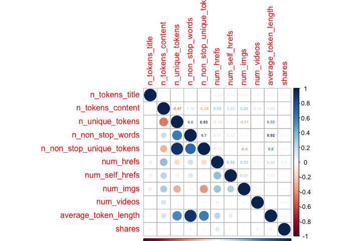
I further explored the data by looking at a correlations plot with the variables I had expressed interest in previously. I divided the variables into different chunks, to make the plots easier to view. I excluded weekday_is variables, as I felt they would only be used for the final creation of the reports, as opposed to being involved in the model. I used the code from our notes (Module 7 - Summarizing Data/Quantitative Summaries) for this purpose. ## Creating First Correlation Plot with First 10 Variables
newsCorrelation1 <- cor(newsDataTrain[,c(1:10, 59)])
corrplot(newsCorrelation1, type="upper", method="number", tl.pos="lt", number.cex=0.5)
corrplot(newsCorrelation1, type="lower", add=TRUE, tl.pos="n", number.cex=0.5)
Creating Second Correlation Plot with Other Variables
newsCorrelation2 <- cor(newsDataTrain[,c(11:20, 59)])
corrplot(newsCorrelation2, type="upper", method="number", tl.pos="lt", number.cex=0.5)
corrplot(newsCorrelation2, type="lower", add=TRUE, tl.pos="n", number.cex=0.5)
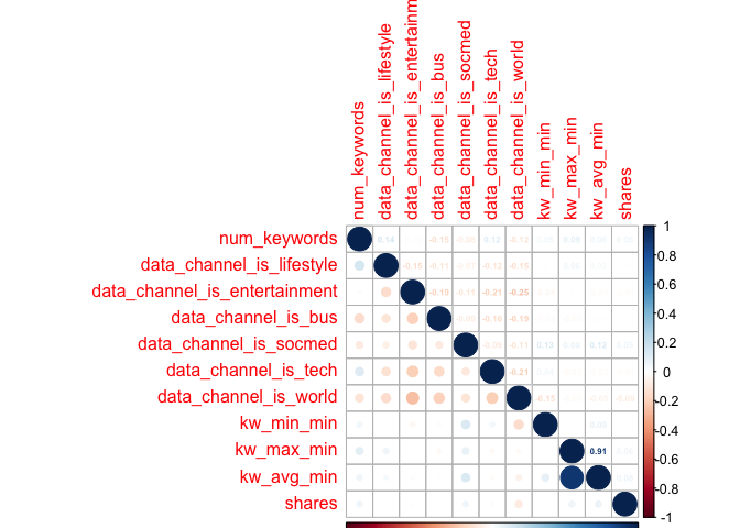
Creating Third Correlation Plot
newsCorrelation3 <- cor(newsDataTrain[,c(21:28, 59)]) #excluding "weekday_is variables"
corrplot(newsCorrelation3, type="upper", method="number", tl.pos="lt", number.cex=0.5)
corrplot(newsCorrelation3, type="lower", add=TRUE, tl.pos="n", number.cex=0.5)
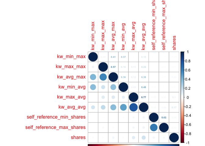
Creating Fourth Correlation Plot
newsCorrelation4 <- cor(newsDataTrain[,c(38:47, 59)]) #excluding "weekday_is" variables
corrplot(newsCorrelation4, type="upper", method="number", tl.pos="lt", number.cex=0.5)
corrplot(newsCorrelation4, type="lower", add=TRUE, tl.pos="n", number.cex=0.5)
Creating Fifth Correlation Plot
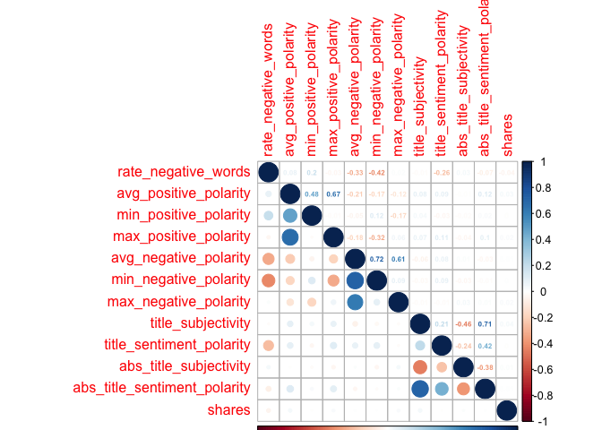
newsCorrelation5 <- cor(newsDataTrain[,c(48:58, 59)]) #excluding "weekday_is" variables
corrplot(newsCorrelation5, type="upper", method="number", tl.pos="lt", number.cex=0.5)
corrplot(newsCorrelation5, type="lower", add=TRUE, tl.pos="n", number.cex=0.5)
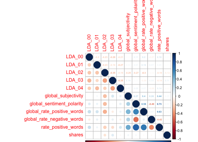
Creating Extra Correlation Plot
I also created an extra correlation plot, to examine some variables that I had taken an interest in, where I thought there could be relationships between the predictor variables. I thought these would be of interest, as perhaps the number of keywords in the metadata would affect likelihood of someone finding the article through SEO (and then sharing it); or maybe social media users would gravitate towards longer/shorter titles, longer/shorter articles, longer/short words, articles with more negative words, and/or articles that have more links, images, or videos.
newsCorrelation6 <- cor(newsDataTrain[,c("num_keywords", "n_tokens_title","n_tokens_content", "num_hrefs", "num_imgs", "num_videos", "average_token_length", "num_keywords", "global_rate_positive_words", "global_rate_negative_words", "shares")])
corrplot(newsCorrelation6, type="upper", method="number", tl.pos="lt", number.cex=0.5)
corrplot(newsCorrelation6, type="lower", add=TRUE, tl.pos="n", number.cex=0.5)
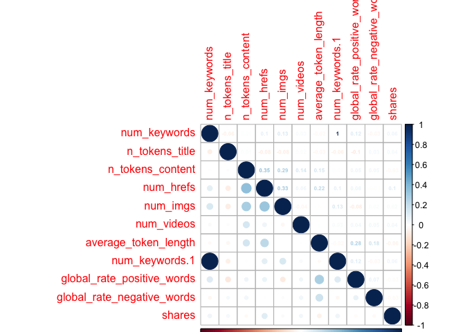
Unfortunately,looking at these six plots, I do not see a substantial relationship between any one variable and the target variable of shares - those low values all appear faded on the correlation plots, representing weak relationships. However, with my final plot I do note some correlation between other variables, suggesting that there may be interactions between them. For example, the highest correlation coefficient value is r=0.45, when looking at num_hrefs and n_tokens_content. This does seem to make practical sense; the more words you have, the more likely you’ll need to include more links. Perhaps less intuitive is the relationship between num_imgs and num_hrefs, with the second-highest correlation coefficient of r=0.36.
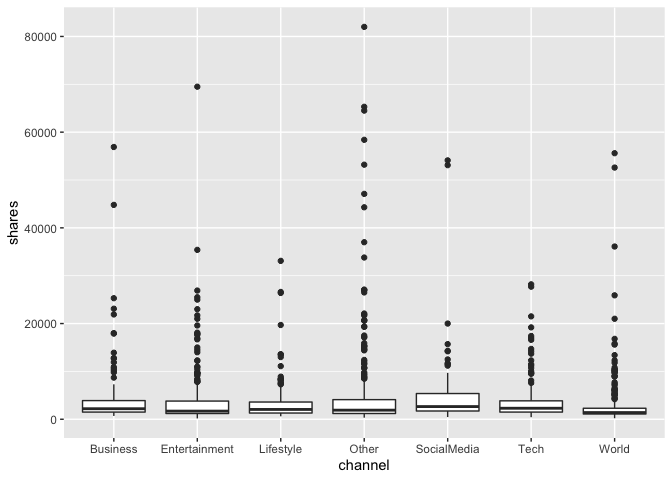
I then created a boxplot showing the shares, classified by the categorical variable of channel that I had created. The summary data (which included all channels) indicated that the median number of shares was around 1400 shares per article, though numerous outliers skew this significantly, so that the mean was 3436 shares. Looking at the plots, there do not seem to be dramatic differences in the data based upon which channel an article has been classified under.
channelsBoxplot <- ggplot(newsDataTrain, aes(x=channel, y=shares))
channelsBoxplot + geom_boxplot()
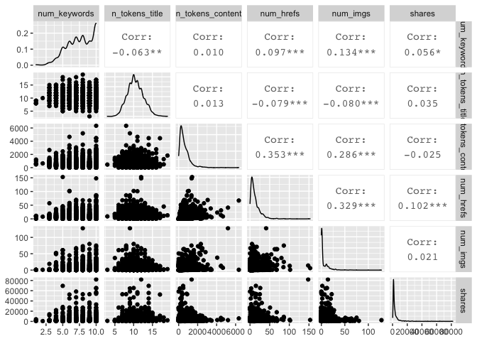
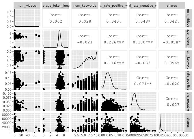
Creating ggpairs Plots
I also created two sets of ggpairs plots, to look at possible relationships in a different way. I again used the variables I looked at in the sixth correlation plot from above.
newsDataTrain %>% select("num_keywords", "n_tokens_title","n_tokens_content", "num_hrefs", "num_imgs", "shares") %>% ggpairs()
newsDataTrain %>% select("num_videos", "average_token_length", "num_keywords", "global_rate_positive_words", "global_rate_negative_words", "shares") %>% ggpairs()
Modeling
Multiple Linear Regression
To begin, I wanted to first establish a better understanding of what the model would look like if I was to incorporate ALL main effects, excluding any interactions or quadratic terms.
Creating Model with All Main Effects
dataFitAll <- lm(shares~., data=newsDataTrain)
#summary(dataFitAll)
The Adjusted R-square values is a very low 0.05065, but I do see that the F-statistic is 6.075, with a very small p-value; it appears that the F-test is significant, in turn suggesting that the model is significant. With an alpha value of 0.01, the following variables are considered significant:
- n_tokens_title
- num_hrefs
- num_imgs
- average_token_length
- kw_avg_max
- kw_min_avg
- kw_max_avg
- kw_avg_avg
- LDA_00
- global_subjectivity
- min_positive_polarity
- data_channel_is_lifestyle
- data_channel_is_entertainment
- data_channel_is_bus
- data_channel_is_socmed
- data_channel_is_tech
- data_channel_is_world
However, since we have not focused on this tactic for selecting variables, I decided to forgo this particular approach, and focus instead upon the correlations that I found in my summarization above. Though all these corrlations were very weak, I’m going to experiment with several different combinations of variables that exhibited the highest correlations to our target variable of shares. I tried not to include variables that were related or otherwise correlated with one another, such as min_negative_polarity or max_negative_polarity; in this case, I instead just chose to include avg_negative_polarity.
The variables, in descending correlation coefficient, were as follows:
- LDA_03, with a correlation coefficient of 0.07
- avg_negative_polarity, -0.06
- kw_avg_max, 0.06
- LDA_02, -0.05
- data_channel_is_world, -0.04 … *For now, I decided
- num_hrefs, 0.032
- average_token_length, -0.030
- global_subjectivity, 0.030
- LDA_04, -0.030
- num_videos, 0.028
- num_imgs, 0.023
Creating Linear Regression Models
I created linear regression models, adding one variable at a time.
dataFit1 <- lm(shares~LDA_03,
               data=newsDataTrain)
dataFit2 <- lm(shares~LDA_03 +
                 avg_negative_polarity,
               data=newsDataTrain)
dataFit3 <- lm(shares~LDA_03 +
                 avg_negative_polarity +
                 avg_negative_polarity,
               data=newsDataTrain)
dataFit4 <- lm(shares~LDA_03 +
                 avg_negative_polarity +
                 avg_negative_polarity +
                 kw_avg_max,
               data=newsDataTrain)
dataFit5 <- lm(shares~LDA_03 +
                 avg_negative_polarity +
                 avg_negative_polarity +
                 kw_avg_max +
                 LDA_02,
               data=newsDataTrain)
dataFit6 <- lm(shares~LDA_03 +
                 avg_negative_polarity +
                 avg_negative_polarity +
                 kw_avg_max +
                 LDA_02 +
                 num_hrefs,
               data=newsDataTrain)
dataFit7 <- lm(shares~LDA_03 +
                 avg_negative_polarity +
                 avg_negative_polarity +
                 kw_avg_max +
                 LDA_02 +
                 num_hrefs +
                 average_token_length,
               data=newsDataTrain)
dataFit8 <- lm(shares~LDA_03 +
                 avg_negative_polarity +
                 avg_negative_polarity +
                 kw_avg_max +
                 LDA_02 +
                 data_channel_is_world +
                 num_hrefs +
                 average_token_length +
                 global_subjectivity,
               data=newsDataTrain)
dataFit9 <- lm(shares~LDA_03 +
                 avg_negative_polarity +
                 avg_negative_polarity +
                 kw_avg_max +
                 LDA_02 +
                 data_channel_is_world +
                 num_hrefs +
                 average_token_length +
                 global_subjectivity +
                 LDA_04,
               data=newsDataTrain)
dataFit10 <- lm(shares~LDA_03 +
                 avg_negative_polarity +
                 avg_negative_polarity +
                 kw_avg_max +
                 LDA_02 +
                 data_channel_is_world +
                 num_hrefs +
                 average_token_length +
                 global_subjectivity +
                 LDA_04 +
                 num_videos,
               data=newsDataTrain)
dataFit11 <- lm(shares~LDA_03 +
                 avg_negative_polarity +
                 avg_negative_polarity +
                 kw_avg_max +
                 LDA_02 +
                 data_channel_is_world +
                 num_hrefs +
                 average_token_length +
                 global_subjectivity +
                 LDA_04 +
                 num_videos +
                 num_imgs,
               data=newsDataTrain)
Choosing the Best Linear Regression Model
I then compared these 12 models, using Adjusted R-squared and AIC.
Comparing Fit Statistics
compareAdjR2 <- function(df1, df2, df3, df4, df5, df6, df7, df8, df9, df10, df11, dfall) {
  adjR2stats <- data.frame(fitStat="Adjusted R Square",
    dataFit1=round(summary(df1)$adj.r.squared, 5),
    dataFit2=round(summary(df2)$adj.r.squared, 5),
    dataFit3=round(summary(df3)$adj.r.squared, 5),
    dataFit4=round(summary(df4)$adj.r.squared, 5),
    dataFit5=round(summary(df5)$adj.r.squared, 5),
    dataFit6=round(summary(df6)$adj.r.squared, 5),
    dataFit7=round(summary(df7)$adj.r.squared, 5),
    dataFit8=round(summary(df8)$adj.r.squared, 5),
    dataFit9=round(summary(df9)$adj.r.squared, 5),
    dataFit10=round(summary(df10)$adj.r.squared, 5),
    dataFit11=round(summary(df11)$adj.r.squared, 5),
    dataFitall=round(summary(dfall)$adj.r.squared, 5))
}
compareAdjR2results <- compareAdjR2(dataFit1, dataFit2, dataFit3, dataFit4, dataFit5, dataFit6, dataFit7, dataFit8, dataFit9, dataFit10, dataFit11, dataFitAll)
compareAdjR2results
##             fitStat dataFit1 dataFit2 dataFit3 dataFit4 dataFit5 dataFit6
## 1 Adjusted R Square  0.01801  0.01822  0.01822  0.01896  0.02049  0.02093
##   dataFit7 dataFit8 dataFit9 dataFit10 dataFit11 dataFitall
## 1  0.02168   0.0225  0.02261   0.02305   0.02306    0.03558
compareAIC <- function(df1, df2, df3, df4, df5, df6, df7, df8, df9, df10, df11, dfall) {
  adjR2stats <- data.frame(fitStat="Adjusted R Square",
    dataFit1=round(AIC(df1), 5),
    dataFit2=round(AIC(df2), 5),
    dataFit3=round(AIC(df3), 5),
    dataFit4=round(AIC(df4), 5),
    dataFit5=round(AIC(df5), 5),
    dataFit6=round(AIC(df6), 5),
    dataFit7=round(AIC(df7), 5),
    dataFit8=round(AIC(df8), 5),
    dataFit9=round(AIC(df9), 5),
    dataFit10=round(AIC(df10), 5),
    dataFit11=round(AIC(df11), 5),
    dataFitall=round(AIC(dfall), 5))
}
compareAICresults <- compareAIC(dataFit1, dataFit2, dataFit3, dataFit4, dataFit5, dataFit6, dataFit7, dataFit8, dataFit9, dataFit10, dataFit11, dataFitAll)
compareAICresults
##             fitStat dataFit1 dataFit2 dataFit3 dataFit4 dataFit5 dataFit6
## 1 Adjusted R Square 82765.59 82765.76 82765.76 82763.76 82758.51 82757.72
##   dataFit7 dataFit8 dataFit9 dataFit10 dataFit11 dataFitall
## 1 82755.66 82754.32 82754.84  82754.07  82755.01   82741.24
Of all the models: dataFitAll has the highest Adjusted R-square value(0.05065) and lowest AIC (97682.44).
Of the models I created, the one with the most variables (dataFit11) has the highest Adjusted R-square value (0.02365) and lowest AIC (97775.44).
Creating Multiple Linear Regression Model Using the 16 Significant Predictive Variables
Though not covered in the class notes, I decided to experiment with a slightly different approach. Working off the model that fits all main effects, I tried to reduce the number of variables using backwards selection - starting with all variables, and then narrowing them down based upon p-value.
dataFitSignif16 <- lm(shares~n_tokens_title +
        num_imgs +
        average_token_length +
        kw_avg_max +
        kw_max_avg +
        kw_min_avg +
        kw_avg_avg +
        LDA_00 +
        global_subjectivity +
        min_positive_polarity +
        data_channel_is_lifestyle +
        data_channel_is_entertainment +
        data_channel_is_bus +
        data_channel_is_socmed +
        data_channel_is_tech +
        data_channel_is_world,
      data=newsDataTrain)
summary(dataFitSignif16)$adj.r.square
## [1] 0.03487538
AIC(dataFitSignif16)
## [1] 82711.44
Incorporating these 16 variables into the model reduces the adjusted R-square to 0.05102, a small improvement. It also yielded a better AIC, of 97647.84, slightly lower than the dataFitAll all-inclusive model.
Now, I’m going to remove the two variables that are NOT significant from dataFit16, and conduct another linear regression.
dataFitSignif14 <- lm(shares~n_tokens_title +
        kw_avg_max +
        kw_max_avg +
        kw_min_avg +
        kw_avg_avg +
        LDA_00 +
        global_subjectivity +
        min_positive_polarity +
        data_channel_is_lifestyle +
        data_channel_is_entertainment +
        data_channel_is_bus +
        data_channel_is_socmed +
        data_channel_is_tech +
        data_channel_is_world,
      data=newsDataTrain)
summary(dataFitSignif14)$adj.r.square
## [1] 0.03478996
AIC(dataFitSignif14)
## [1] 82709.81
However, even though the result returned indicates that all variables are significant at the alpha=0.05 level, this model reduced the Adjusted R-square to 0.05055098. I will not be further reducing this model and would prefer to use the previous model, with the higher Adjusted R-square value (dataFit16).
Comparing Root MSE
While the fit statistics are one way to determine which model is best, prediction error is actually preferred. After looking at several options, I decided to use cross-validation, per the HW 9 prediction key from Avy. With this approach, which uses 10 folds, I was able to calculate the Root Mean Square Error for the two models on the Training set. Root MSE is a measure of the differences between predicted values and the actual observed values; when comparing numbers, a lower number means a model that’s more effective at prediction.
control <- trainControl(method="cv", number=10)
fit11Train <- train(as.formula(dataFit11), data=newsDataTrain, method="lm", trControl=control)
fit11Train$results$RMSE
## [1] 7410.049
fitSignif16Train <- train(as.formula(dataFitSignif16), data=newsDataTrain, method="lm", trControl=control)
fitSignif16Train$results$RMSE
## [1] 7319.897
I then did the same with the Test set.
control <- trainControl(method="cv", number=10)
fit11Test <- train(as.formula(dataFit11), data=newsDataTest, method="lm", trControl=control)
fit11Test$results$RMSE
## [1] 7971.706
fitSignif16Test <- train(as.formula(dataFitSignif16), data=newsDataTest, method="lm", trControl=control)
fitSignif16Test$results$RMSE
## [1] 8109.797
We see that the model fitSignif16Test has a lower RSME for both the Training and Test set; therefore, when looking at our linear models, we would choose this one.
Creating Ensemble Model with Random Forest
Since we’re focusing on prediction when it comes to the accuracy of our
models, I decided to use the random forest method for my ensemble
learning method. As noted in my introduction, the random forest method
tends to be a superior verison of the bagging method for bootstrap
aggregation, as it helps avoid . For this purpose, I was originally
going to use the caret package, as demonstrated in Homework 12;
however, the computation time was VERY long, and I found that the
randomForest() function from the randomForest package to be more
efficient.
#trctrl <- trainControl(method="repeatedcv", number=10, repeats=3)
#set.seed(1)
#rfNewsDataFitCaret <- train(shares~., data=newsDataTrain, method="rf",
#                            trainControl=trctrl,
#                            preProcess = c("center", "scale"))
As suggested in the notes (and confirmed by this Duke ArcToolbox Fit
Random Forest Model
resource),
the mtry option helps us get a smaller number of predictors, with the
default number being the total number of predictor variables divided by
three.
rfNewsDataFit <- randomForest(shares~., data=newsDataTrain, mtry=ncol(newsDataTrain)/3, ntree=200, importance=TRUE)
rfNewsDataPred <- predict(rfNewsDataFit, newdata=newsDataTest)
summary(rfNewsDataPred)
##    Min. 1st Qu.  Median    Mean 3rd Qu.    Max.
##     940    2081    2924    3747    4405   27240
fit16NewPred <- predict(dataFitSignif16, newdata=newsDataTest)
summary(fit16NewPred)
##    Min. 1st Qu.  Median    Mean 3rd Qu.    Max.
##   286.7  2152.4  2772.6  3268.1  3810.8 29318.3
Comparing Two Models on Test Data Set
I compared the random forest model to to our linear model from before, dataFit16. To compare the two models and determine which is preferrable, I calculated the root MSE values on the Test dataset that I created earlier.
rfRMSE <- sqrt(mean((rfNewsDataPred-newsDataTest$shares)^2))
rfRMSE
## [1] 8949.476
datafit16RMSE <- sqrt(mean((fit16NewPred-newsDataTest$shares)^2))
datafit16RMSE
## [1] 8874.317
Both models have a very similar RMSE. A lower RSME is preferred; in this case, the linear regression model - dataFit16 - is considered a better fit than the random forest option.
Automation & Conclusions
I was unable to complete the automation component of this assignment. Instead, I knit 7 separate reports. I included conclusions about each of the sets on my Project-2 GitHub Pages site.